Simply Eat
Simply Eat is a mobile app designed to help individuals overcome the daily challenge of deciding what to eat, especially when managing cravings or dietary preferences. This often leads to repetitive meals or unhealthy habits that affect overall wellness and satisfaction.
As the lead designer, I was responsible for shaping the product experience from end to end. My role included user research, UX/UI design, wireframing, and prototyping. Over the course of this 1-month project, I focused on creating an intuitive, visually engaging platform that makes everyday meal decisions simpler and more fulfilling.
the goal of this project
Our goal was to simplify the meal planning process by offering a variety of food ideas based on users' cravings.
When users click on a food item, they should be able to access recipes to prepare the selected dish at home, promoting culinary exploration and healthier eating habits. The app encourages culinary exploration and promotes healthier eating habits.
the 4 week design process
01 research —> 02 define —> 03 design —> 04 test
01 research
starting with curiosity
Before diving into design, I wanted to understand what really drives people’s food choices especially when cravings and dietary needs come into play. What makes someone say, “Yes, that’s what I want to eat today”?
To find out, I conducted a competitive analysis of three popular meal planning and recipe apps. I explored how they worked, what users loved about them, and where they fell short. This gave me a clearer picture of what’s already out there and what users might still be missing.
Here’s what stood out:
Apps that feel personal keep users coming back.
A big recipe library isn’t enough: good search tools are key.
Short videos and quick recipes make things more fun.
Customization and community help users feel more connected and supported.
listening to real people
After learning what other apps were doing, we wanted to hear directly from the people we were designing for. So, we sat down with five users to talk about their cravings, how they plan meals, and what makes that process frustrating or fun.
To make sense of it all, I created an affinity map to spot patterns and key pain points across the interviews. This helped us zero in on what really matters to users, and laid the groundwork for designing a solution that truly supports their needs.
Here’s what we discovered:
Many users feel stuck in a loop of the same meals.
Decision fatigue is real especially when juggling cravings, health goals, and limited time.
People want smart, personalized help that fits their lifestyle and makes choosing what to eat a whole lot easier.

02
define
understanding the users
To design a solution that truly fits our users, I needed to dive deep into their needs, challenges, and goals. This helped us shape a focused strategy that would guide the design process and keep the product user-centered.
After completing the research, I created two personas:
Bella, a yoga instructor focused on maintaining a balanced diet for her fitness
Brian, a busy student looking for quick, healthy, and affordable meal options to fit his hectic schedule.


key focus areas
The next step was defining the specific challenges we wanted to tackle. Here’s what we set out to explore:
Simplifying Meal Planning: How can we offer users both specific and varied meal options to reduce decision fatigue?
Health-Conscious Options: How can we help users easily find meals that align with dietary restrictions and support health goals like weight management or muscle building?
Convenience and Affordability: How can we offer quick, nutritious, and budget-friendly meals for busy users without compromising on their health?
structuring the app
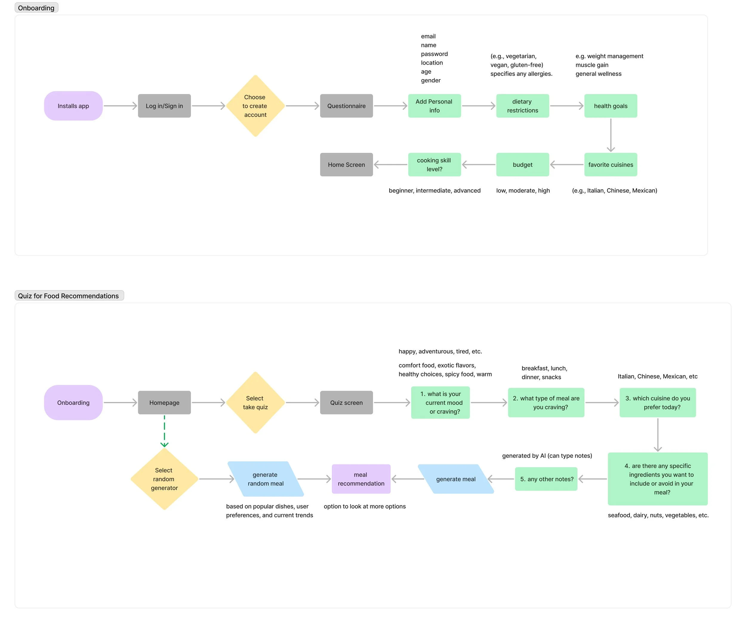
sitemap
When designing the sitemap, I focused on prioritizing the key functions and organizing them into clear categories. These categories were placed in the bottom navigation bar for easy, quick access. To enhance user experience, I also included a homepage that offers quick summaries of these categories and provides seamless access to the user’s profile.
user flows
I focused on two key user flows:
Account Creation
Personalized Food Recommendation Quiz
The goal was to make the experience effortless while delivering tailored recommendations that truly met the users’ needs.
03
design
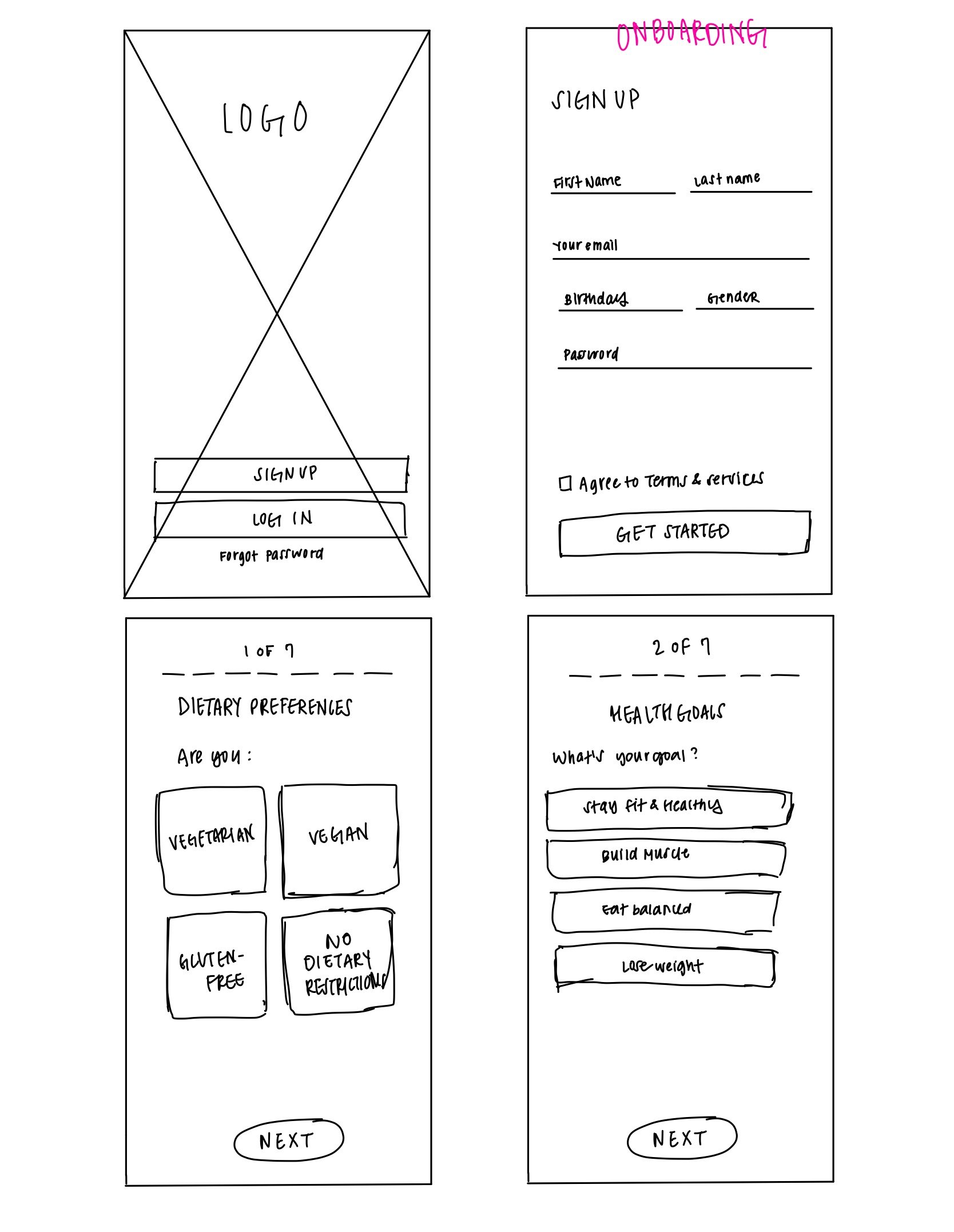
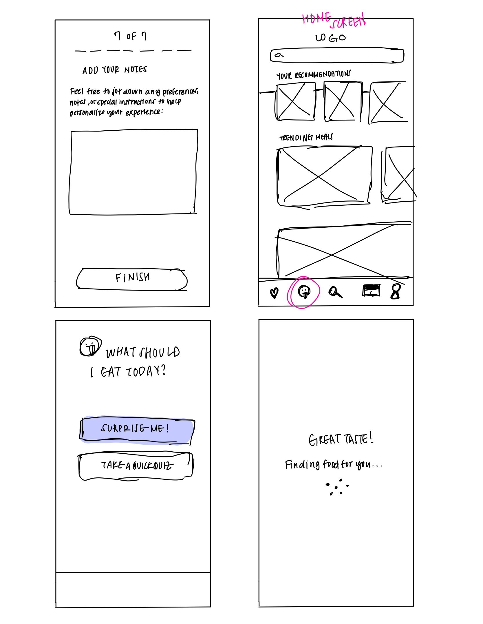
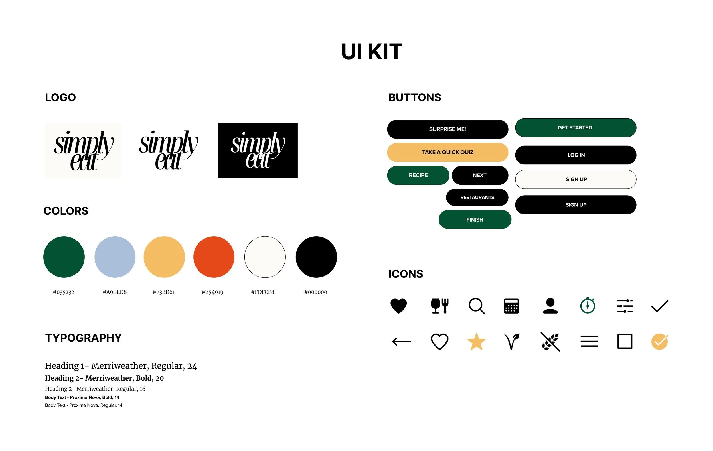
wireframing & branding
Our goal was to create wireframes that show how the app will be organized and laid out.
At the same time, we worked on developing the branding to give the product a clear and recognizable visual identity.
This phase was important to make sure the design is both attractive and easy to use.


04
test
our goal is to refine the design by using prototypes — conducting testing and making iterations.
testing & iterating
testing methods
I conducted both remote and in-person usability testing with five participants to assess how easily users could navigate the app and complete essential tasks. Tasks included:
creating a profile
finding meal ideas
Throughout the testing, I observed user interactions, noting any difficulties or confusion.
results
Users found the app easy to use and appreciated the personalized meal suggestions.
Navigation and layout were clear and easy to follow.
Participants successfully found necessary information about meals without significant challenges.
goals
Assess the ease of use and intuitiveness of the onboarding process
Evaluate the effectiveness of personalized meal recommendations based on user preferences and dietary restrictions
Determine the user's ability to navigate the app, find meals, and access detailed information about recommended dishes
Identify usability issues, pain points, and areas for improvement in design and functionality
minor issues
Clearer instructions needed during onboarding
Option for additional dietary restrictions should be considered


conclusion
This project was a valuable opportunity to address real challenges in meal planning and decision-making. By focusing on user needs through research, testing, and thoughtful design, I developed a solution that simplifies meal choices and offers a more personalized experience.
challenges
Understanding users' different needs took time and research. I had to balance good design with functionality, making sure the app looked nice but was still easy to use. Collecting and applying feedback meant staying flexible and managing time well.
final thoughts
I learned how important it is to focus on user needs and keep testing ideas to make the product better. Being open to feedback and new directions helped me build a stronger, more user-friendly app.