Tomi Jazz
Tomi Jazz is a well-known jazz bar in New York City, valued for its cozy ambiance and live performances. While the bar itself creates a welcoming and memorable experience, its website did not reflect the same charm. The outdated design made it difficult for visitors to navigate, find event information, or get a sense of what makes Tomi Jazz unique.
This disconnect became the focus of my redesign project. As the lead designer, I set out to create a website that not only looked modern and visually engaging, but also made essential information clear and easy to access. My role included research into user needs, UX/UI design, wireframing, usability testing, and prototyping.
The goal was to design an online experience that felt as inviting as the bar itself while ensuring the site was fully functional, accessible, and responsive across devices.
the goal of this project
Our goal was to redesign the Tomi Jazz website to better reflect the bar’s unique atmosphere and offerings.
The new site needed to make it easy for visitors to explore upcoming performances, view the menu, and learn what makes Tomi Jazz special.
By creating a visually engaging and user-friendly platform, the redesign aimed to capture the character of the jazz bar while improving navigation and access to essential information.
the 4 week design process
01 research —> 02 define —> 03 design —> 04 test
01 research
looking outward
Before shaping the redesign, I wanted to see how other jazz clubs introduce themselves online. The goal wasn’t just to compare aesthetics, but to understand how different venues communicate atmosphere, showcase events, and guide visitors through their sites.
I studied three New York jazz clubs: Smoke Jazz Club, Terra Blues, and Arthur’s Tavern.
From this analysis, a few insights stood out:
First impressions matter. Sites that quickly highlight performances and atmosphere build excitement right away.
Ease of use counts. Simple, intuitive navigation makes visitors more likely to explore further.
Details complete the picture. Menus, calendars, and reservation tools help transform curiosity into action.

from the audience
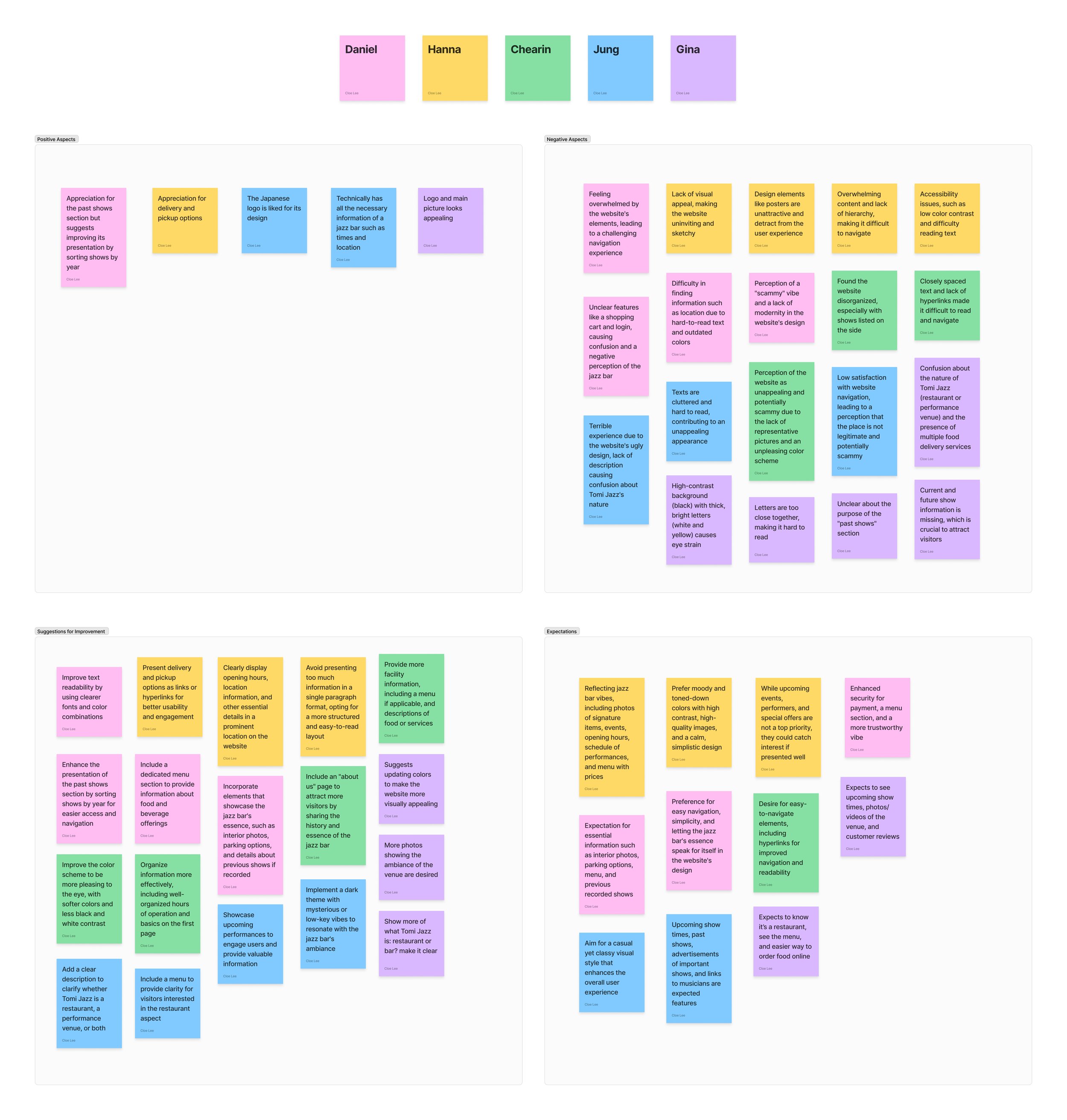
To ground the redesign in real experiences, I asked five users to navigate the existing Tomi Jazz website and share their thoughts as they went. I observed what caught their attention, what frustrated them, and how the site shaped their perception of the jazz bar.
The feedback was eye-opening. Users consistently described the site as cluttered, outdated, and confusing. Many struggled to find basic information like event schedules, menus, or even a clear description of what Tomi Jazz is. Several participants said the design felt “scammy” or untrustworthy, and that they would hesitate to make payments through it. The lack of hierarchy, poor readability, and overwhelming visuals left users with a negative impression of the bar itself.
To make sense of the feedback, I created an affinity map that grouped comments into common themes. Clear patterns emerged:
Trust and credibility were missing. The outdated design made users question whether Tomi Jazz was legitimate.
Navigation was overwhelming. Information was scattered and difficult to parse.
Key details were hard to find. Users expected showtimes, menus, photos, and ambiance to be front and center.
The site didn’t match the experience. Instead of reflecting the cozy, intimate vibe of a jazz bar, it felt disconnected and impersonal.
02
define
understanding the users
To keep the redesign user-centered, I created two personas based on interview insights.
Gina, a 30-year-old entrepreneur from Brooklyn, values visually engaging and streamlined online experiences. She found Tomi Jazz’s website overwhelming and untrustworthy, especially when trying to order food.
Daniel, a 27-year-old investment banker and jazz enthusiast, enjoys exploring new venues but was frustrated by the site’s clutter and lack of secure payment options.
Together, Gina and Daniel represent the core issues: poor navigation, lack of trust, and weak visual storytelling.


balancing needs and objectives
The redesign of Tomi Jazz’s website needed to balance user expectations, business objectives, and technical requirements.
From the user perspective, visitors wanted an easy way to explore upcoming performances, browse menus, place food and drink orders online, and quickly find practical details.
For the business, the primary goals were to increase online engagement and event attendance, grow revenue through online orders, and strengthen Tomi Jazz’s brand image.
Finally, technical considerations played a crucial role. The new design had to be responsive across devices and browsers.
key focus areas
With user insights and problem statements defined, I outlined the specific challenges this redesign needed to address. Here’s what we set out to solve:
Improving Online Ordering: How can we make food and drink orders on the website simple, intuitive, and trustworthy so customers feel confident completing a purchase?
Highlighting Performances: How can we ensure event details are easy to find and engaging, so visitors are more likely to attend shows and stay connected with Tomi Jazz?
Enhancing Usability and Design: How can we redesign the site to feel visually inviting, easy to navigate, and reflective of Tomi Jazz’s unique atmosphere?
structuring the app
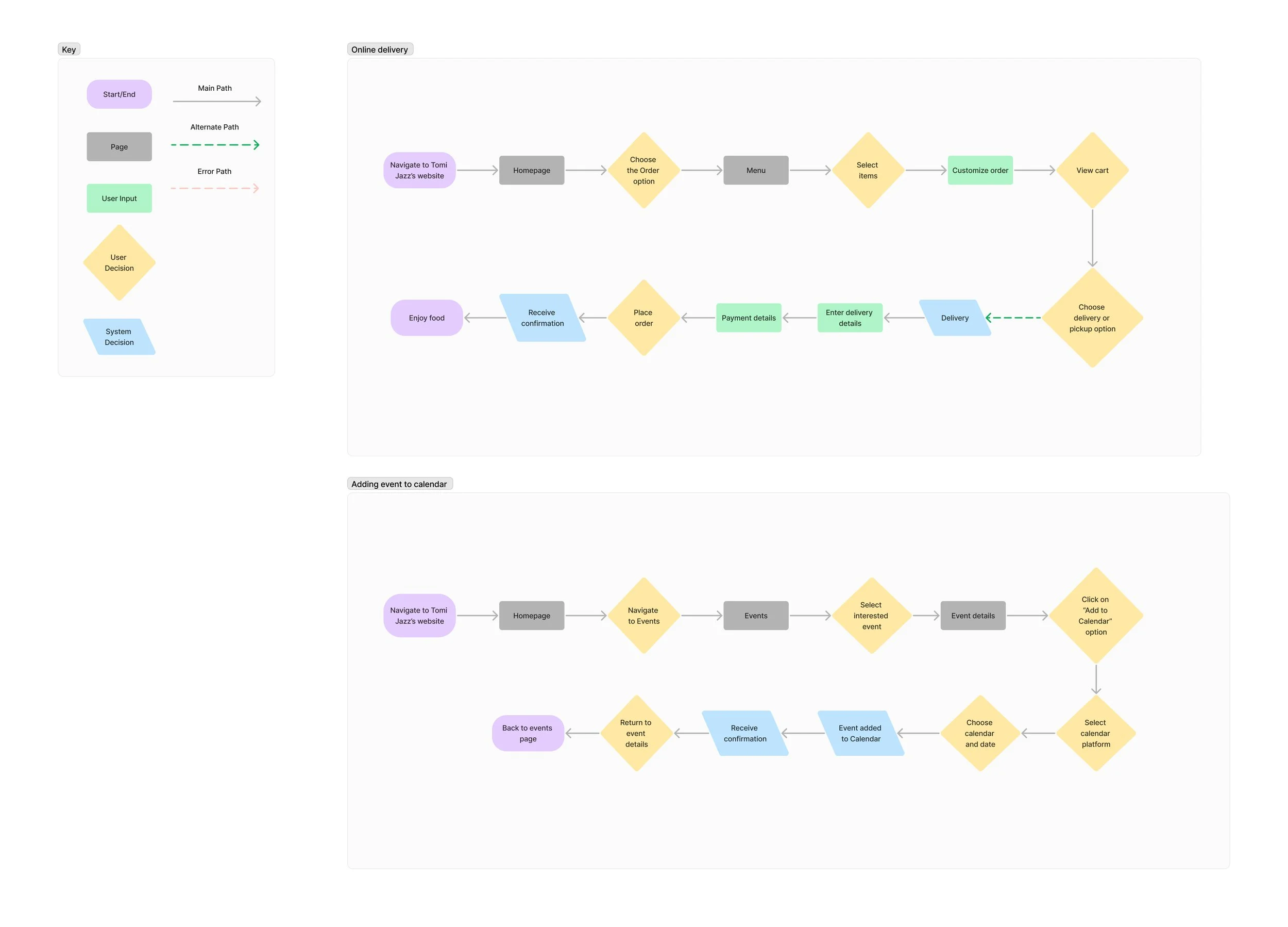
user flows
I created two user flows:
one for viewing menu and ordering delivery
and the other is adding an event to calendar
03
design
wireframing
low-fidelity wireframes
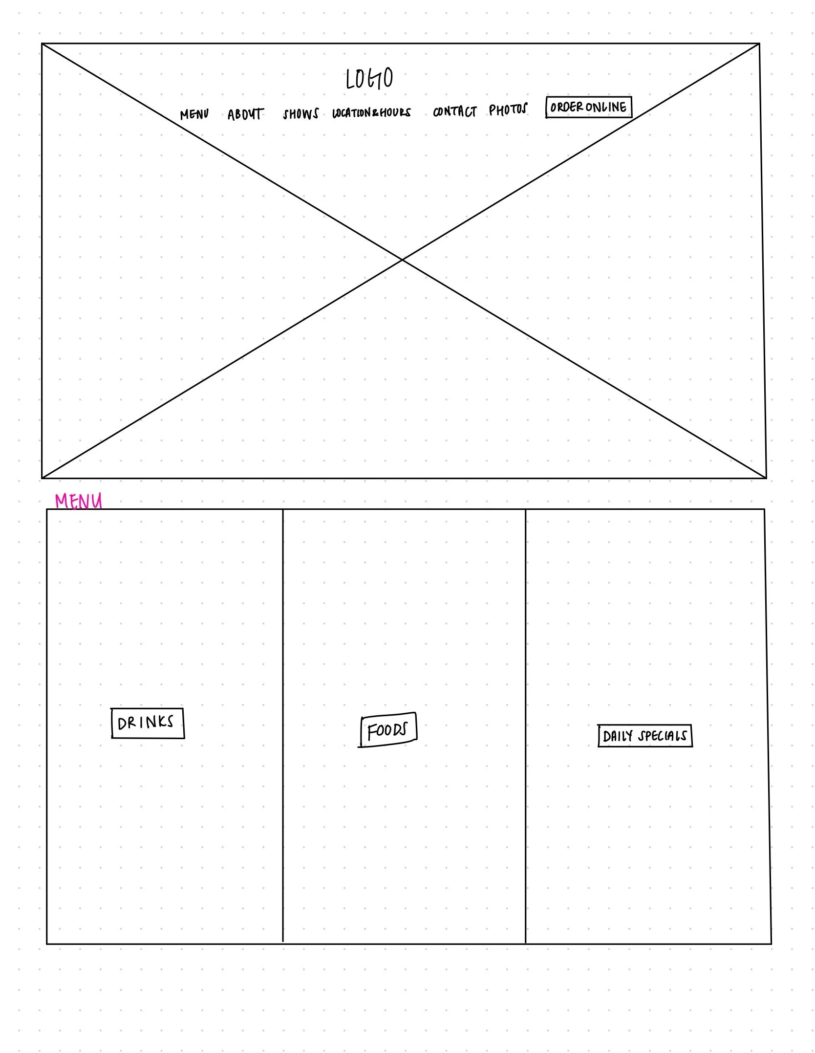
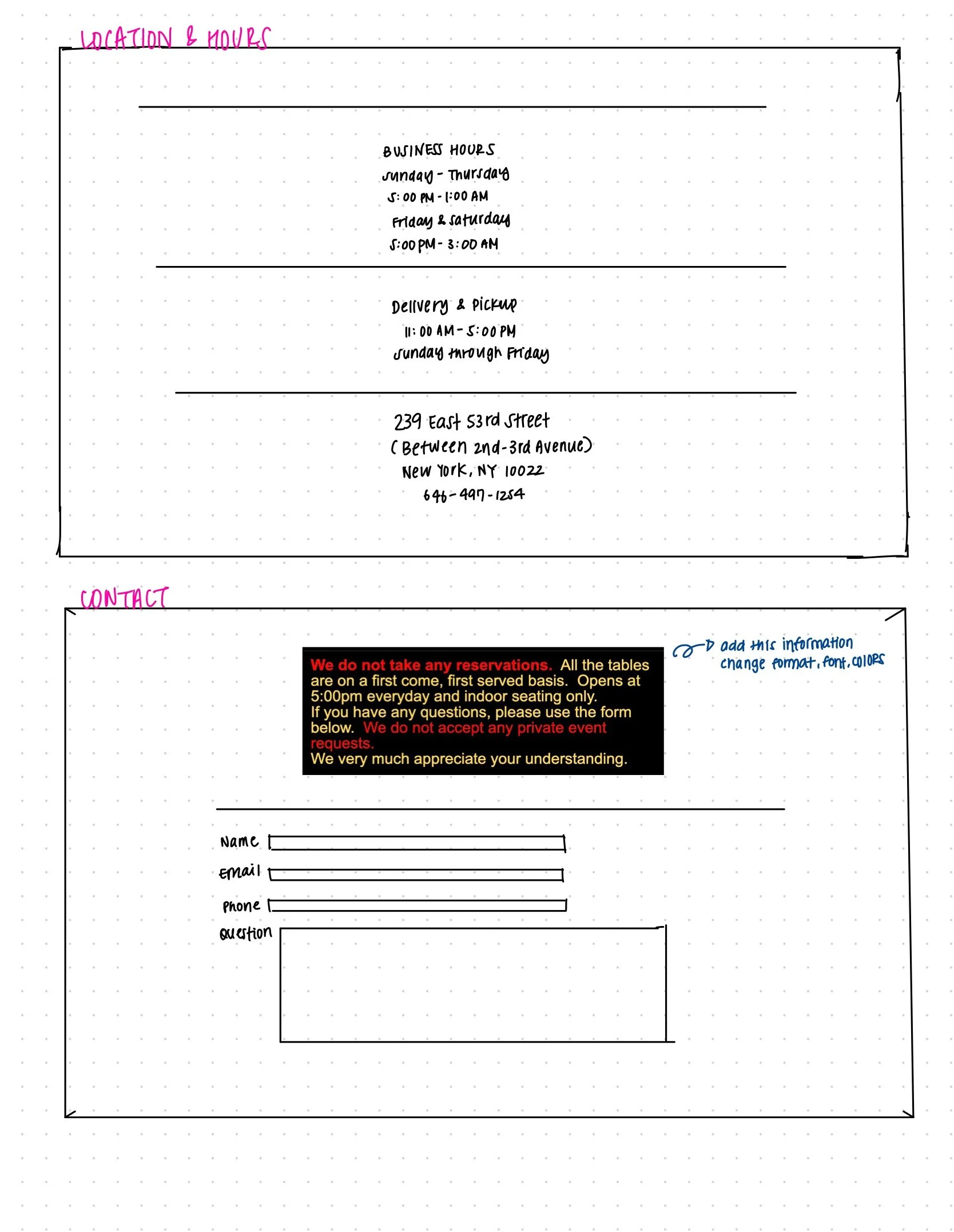
To translate research insights into structure, I created low-fidelity wireframes that mapped out the redesigned Tomi Jazz website.
The goal was to establish clear navigation, prioritize essential information, and introduce a reliable online ordering system.


mid-fidelity wireframes
Building on the initial sketches, I developed mid-fidelity wireframes. These introduced clearer structure and adjustments to the online ordering flow, from browsing the menu to checkout. The mid-fidelity stage also prepared the design for usability testing, where real user feedback would guide further iterations and improvements.

usability testing
Once the mid-fidelity wireframes were ready, I wanted to see how real people would interact with the site. I ran usability tests with four participants and asked them to find event details, explore the menu, and place an online order.
Everyone was able to navigate the site and complete an order without major issues. But a few interesting patterns popped up:
The wording of “View Menu” caused confusion as most users clicked it before starting an order.
The “Order Online” button wasn’t clear enough on the homepage.
Typography and cart interactions needed refinement for clarity and trust.
These takeaways gave me a clear path forward:
Rename “View Menu” with a clearer call-to-action.
Make the “Order Online” button more prominent.
Improve typography, and add direct “Add to Cart” buttons.
branding
I put together a moodboard to capture the feel of Tomi Jazz: a low-key NYC bar with Japanese bites, live jazz, and a cozy speakeasy vibe.
The goal was to translate that atmosphere into visuals that could guide the redesign and make the website feel as inviting as the space itself.

UI interaction
high-fidelity wireframes
Next, I created high-fidelity mockups. I focused on creating a cleaner look, highlighting events, and building a smoother online ordering system with clear steps from browsing the menu to checkout.
After mentor feedback, I iterated on details like hierarchy, typography, and confirmation pages to improve usability and trust.
The final designs capture the cozy, speakeasy vibe of Tomi Jazz while making the site easier to navigate and order from.


04
test
our goal is to refine the design by using prototypes — conducting testing and making iterations.
testing
testing methods
Once the wireframes were ready, I ran usability tests with five participants. I asked them to:
(1) explore the site
(2) look for key details like events and menus
(3) go through the online ordering flow from start to finish
goals
The main goal was simple: see if people could use the site without friction, and spot any places where confusion or hesitation popped up.
results
All participants were able to complete the main tasks: finding events, browsing the menu, and placing an order.
Users described the site as organized, simple, and much easier to use than the original Tomi Jazz website.
Satisfaction was high, with most participants rating the experience 5/5.
The ordering process was seen as smooth and straightforward.
minor issues
The “Order Online” button wasn’t clear.
Users wanted a confirmation pop-up after adding items to the cart.
A few users raised concerns about allergies not being visible in the ordering process.
iterations
Based on our test results, I made several key updates to refine the site. These small but meaningful changes reduced confusion, built trust, and made the overall flow smoother.
I added a message that appears after “Add to Cart” to reassure users their item was successfully added.
I Introduced a field where users can easily add allergy details when ordering.


conclusion
This project really helped me grow as a designer. I learned to put aside my own preferences and focus on what users actually need, letting research and feedback guide my decisions.
I realized that even the smallest changes, like updating a button label or adding a confirmation message, can completely change how people experience and trust a website.
What I loved most was seeing my ideas come to life and watching users interact with them. It reminded me why I enjoy design so much. It is about solving real problems in ways that feel natural and human.
Moving forward, I want to keep testing early, listening to different perspectives, and paying attention to the little details that make the biggest impact.